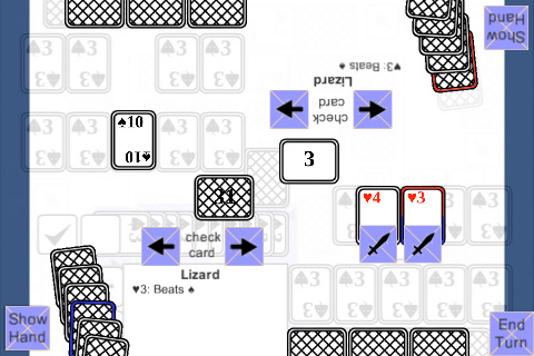
Screenshot shows the visual when both players have the same card highlighted. I thought the fading in and out was a bit too much and I also tried having 2 borders but it didn’t look quite right. I quite like the current version.
I did notice some bugs though. Some of them are:
- Borders go on top of cards in the hand after a card is played.
- Order of cards you navigate to while checking is not right after a card is played.
- Playing a card revealed makes it hidden.
Need to fix those.
What’s next: fixing those bugs and then hopefully being able to get the spell confirmation button.

Leave a Reply